How to Build a Simple Transparent Login Form with HTML and CSS

Technical Writer
In this tutorial, we will create a simple, responsive login form using only HTML and CSS.
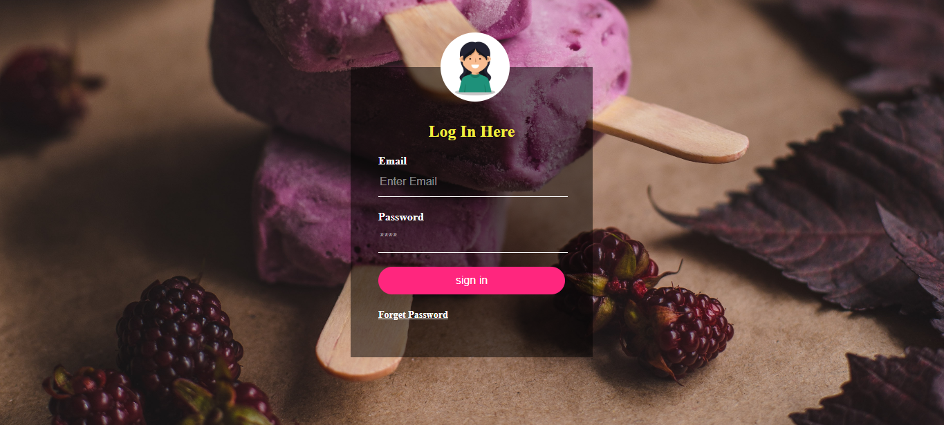
As you can see in the above image, the login form has a transparent design and a background image.
Note: The code for this project can be found on my GitHub, and the deployed link to view the project is here.
Prerequisites
This tutorial is quite beginner-friendly, although it requires basic knowledge of HTML and CSS.
We will also be adding some cool HTML features, like adding validations and constraining the length of your entities.
Let's dive in!
Building the Login Page
To build this, we first need to open our code editor and create two files called index.html and style.css.
The HTML Markup
First, we need to establish the HTML boilerplate and ensure that our stylesheet is correctly linked from the head tag before defining the markup for our sign-up form. To simplify this process using your IDE or code editor, you can utilize the Emmet plugin by typing "!" and pressing the tab.
<!DOCTYPE html>
<html lang="en">
<head>
    <meta charset="UTF-8">
    <meta name="viewport" content="width=device-width, initial-scale=1.0">
    <link rel="stylesheet" href="style.css">
    <title>Basic LogIn Form</title>
</head>
<body>

</body>
</html>
Within the body tag, we define the markup for our login form:
 <div class="loginBox">
        <img src="femaleavater.jpg" alt="">
        <h2>Log In Here</h2>
        <form>
            <p>Email</p>
            <input type="email" name="" placeholder="Enter Email">
            <p>Password</p>
            <input type="password" name="" placeholder="****">
            <input type="submit" name="" value="sign in">
            <a href="#">Forget Password</a>
        </form>
    </div>
In our HTML file, we have created an <div> element with a class attribute set to 'login box'. It serves as a container for the login box content. In the<div> element, we added an<img> element that displays an image of a female avatar. The 'src' attribute specifies the image file path and the 'alt' attribute provides alternative text for accessibility purposes.
We also created a <form> element that contains the input fields and buttons for the login form. The<input> element of type "text" is used for entering an email address, while the element of type "password" is used for entering a password. The<a> anchor element is used as a link for password recovery.
How to Style the Form
Our form is pretty basic, so let's add some styling to make it look nicer. Let's now add our CSS:
/*Get rid of all default margins/paddings on the body tag */
body{
    margin: 0;
    padding: 0;
    background: url('backgroundimage.jpg');
    background-size: cover;
    background-repeat: no-repeat;
}
The body selector sets the margin and padding of the body element to 0, ensuring there are no default margins or paddings. It also applies a background image using url('backgroundimage.jpg'), with the background-size set to cover and the background-repeat set to no-repeat.
img{
  width: 100px;
  height: 100px;
  border-radius: 50%;
  overflow: hidden;
  position: absolute;
  top: calc(-100px/2);
  left: 130px;
}
Theimg selector styles the image. It sets the width and height to 100px, applies a border-radius of 50% to create a circular shape, and hides any overflow. The image is positioned using position:absolute, and it is placed at the top:calc(-100px/2) and left:130px, centering it within its container.
/*h2 tag*/
h2{
    margin: 0;
    padding: 0 0 20px;
    color: #efed40;
    text-align: center;
}
We will style the h2 heading element, by setting the margin to 0, padding to 0, 0, 20px (0 top, 0right, 20px bottom), and the colour to #efed40 [a yellowish colour], thereafter we will align our text to the centre, using the text-align property.
/* login class attribute */
.loginBox{
    position: absolute;
    top: 50%;
    left: 50%;
    transform: translate(-50%, -50%);
    width: 350px;
    padding: 80px 40px;
    height: 420px;
    box-sizing: border-box;
    background: rgba(0, 0, 0, .5);
}
We will style the loginBox selector, which styles the class 'login box,' which positions the box absolutely at the top: 50% and left: 50%, then translates it -50% horizontally and -50% vertically to center it on the screen. We will also set the width to 350px and the padding to 80 px and 40 px [80px top/bottom, 40px left/right], height to 420 px, and box-sizing to border-box to include padding in the width and height calculations. Lastly, we will apply a background-color of rgba [0,0,0,.5], which is a semi-transparent black.
/*loginBox p element*/
.loginBox p{
    margin: 0;
    padding: 0;
    font-weight: bold;
    color: #fff;
}
We will style the <p> element inside the loginBox. We set the margin and padding to 0, font-weight to bold, and color to #fff (white).
Styling Input and Buttons
Now we need to style our inputs.
/*loginBox input element */
.loginBox input{
    width: 100%;
    margin-bottom: 20px;
}

/*loginBox input type, text and password*/
.loginBox input[type='text'],
.loginBox input[type='password']{
    border: none;
    border-bottom: 1px solid #fff;
    background: transparent;
    outline: none;
    height: 40px;
    color: #fff;
    font-size: 16px;
}

/*styling the placeholder */
::placeholder{
    color: rgba(255, 255, 255, .5);
}
The .loginBox input[type='text'] and .loginBox input[type='password'] selector styles the input elements with the type text and password inside the loginBox. Finally, we will style the placeholder text of input fields, by setting the color to rgba (255,255,255, .5), which is a white color with 50% transparency.
Now we are going to focus on the buttons.
We'll add a background color, border-radius, and set the cursor to pointer. Next, we will add a hover effect that changes the colour of the buttons once it's hovered over.
/*styling the input submit field*/
.loginBox input[type='submit']{
     border: none;
     outline: none;
     height: 40px;
     color: #fff;
     font-size: 16px;
     background: #ff267e;
     cursor: pointer;
     border-radius: 20px;
}

/*Adding a hover effect to the submit button*/
.loginBox input[type='submit']:hover{
    background: #efed40;
    color: #262626;
}
Lastly, we will style the anchor <a> element with the class loginBox, with the following CSS, we will set the text colour to white and the font-size 14px.
/*Adding the a tag*/
.loginBox a{
    color: #fff;
    font-size: 14px;
}
Adding Validations and Constraining the Length of Your Entities
The simplest HTML validation feature is the required attribute. To make an input mandatory, add this attribute to the element. Now, we will add the required attributes to the input, as shown below.
<input type="email" name="" placeholder="Enter Email" required >
<input type="password" name="" placeholder="****" required >
Finally!
We are going to constrain the character length of all text fields by <input> using minlength and maxlength attributes. A field will be invalid if it has a value and that value has few characters than the minlength value or more than the maxlength value.
<input type="password" name="" placeholder="****" required minlength="6"
 maxlength="6">
Conclusion
In this article, we created a login form and added some basic functionalities. We also validated the form by adding the required attribute and also we added the constrained character length of the <input> field by using the minlength and maxlength I hope you learned some new things about HTML and CSS in this tutorial.
Till next time guys, Bye!
Resources
Connect with me
Follow me on Twitter LinkedIn GitHub to stay updated with my latest content.


